
Key takeaways:
- Gantt chart templates provide a quick way to visualize tasks, timelines, and dependencies without having to build a project schedule from scratch.
- Templates work well for simple or short-term projects, but they become difficult to maintain as complexity, collaboration needs, or task volume increases.
- Manual updates, limited automation, and missing features like milestones or dependencies are the biggest drawbacks of traditional spreadsheet-based Gantt templates.
- Gantt chart software, such as Wrike, provides real-time updates, automated scheduling, built-in collaboration, and integrated task management that templates cannot match.
- Teams that rely on Gantt charts for ongoing project visibility and efficient execution benefit most from moving from static templates to dynamic software solutions.
For a project team to work as a well-oiled machine, you need a schedule that accounts for everyone’s work, shows how tasks fit into the big picture, and highlights the critical path that takes the project from ideation to delivery. The Gantt chart — a visual representation of the task durations and dependencies in your project — is a popular and effective way to give your team this all-inclusive, user-friendly overview.
In this post, I’ll show you some simple Gantt chart templates you can use to cover everything from a basic workflow to a multi-phase project.
Using Google Sheets, these templates will help you:
- Allocate time to individual tasks and build an accurate schedule
- Track progress for informed resource allocation
- Highlight task dependencies and milestones to keep you on track
- Improve communication in your team
But I’ll be honest upfront: There are drawbacks to working with generic templates, and you’ll only really see all these benefits with a Gantt chart that’s built to handle all the work you need to throw at it.
So, in the second part of this post, I’ll also highlight the benefits of Gantt chart software with features to manage complex, long-term projects for your team.
Wrike is a work management platform that tracks your projects from every angle — including responsive Gantt charts. International teams at companies like Sony Pictures Television, Lead Express, and Brief Media use Wrike’s Gantt charts every day. Find out more here:
What is a Gantt chart template?
A Gantt chart template is a prebuilt layout that helps you create a project timeline quickly without starting from scratch. It includes the key components of a Gantt chart: task lists, start and end dates, task bars, and sometimes dependencies or milestones arranged in a ready-to-use structure. Instead of manually formatting a spreadsheet or building a timeline from the ground up, you can plug your project information into the template and generate a visual schedule in minutes.
Teams use Gantt chart templates to plan tasks, estimate durations, map out phases, and track progress more consistently across projects. Templates are commonly available in Excel, Google Sheets, and PDF formats, but they are most powerful when used as a starting point before transitioning into dynamic project management software that updates automatically as work changes.
Simple Gantt chart templates
Let’s start with a Gantt chart template for a simple, linear project:
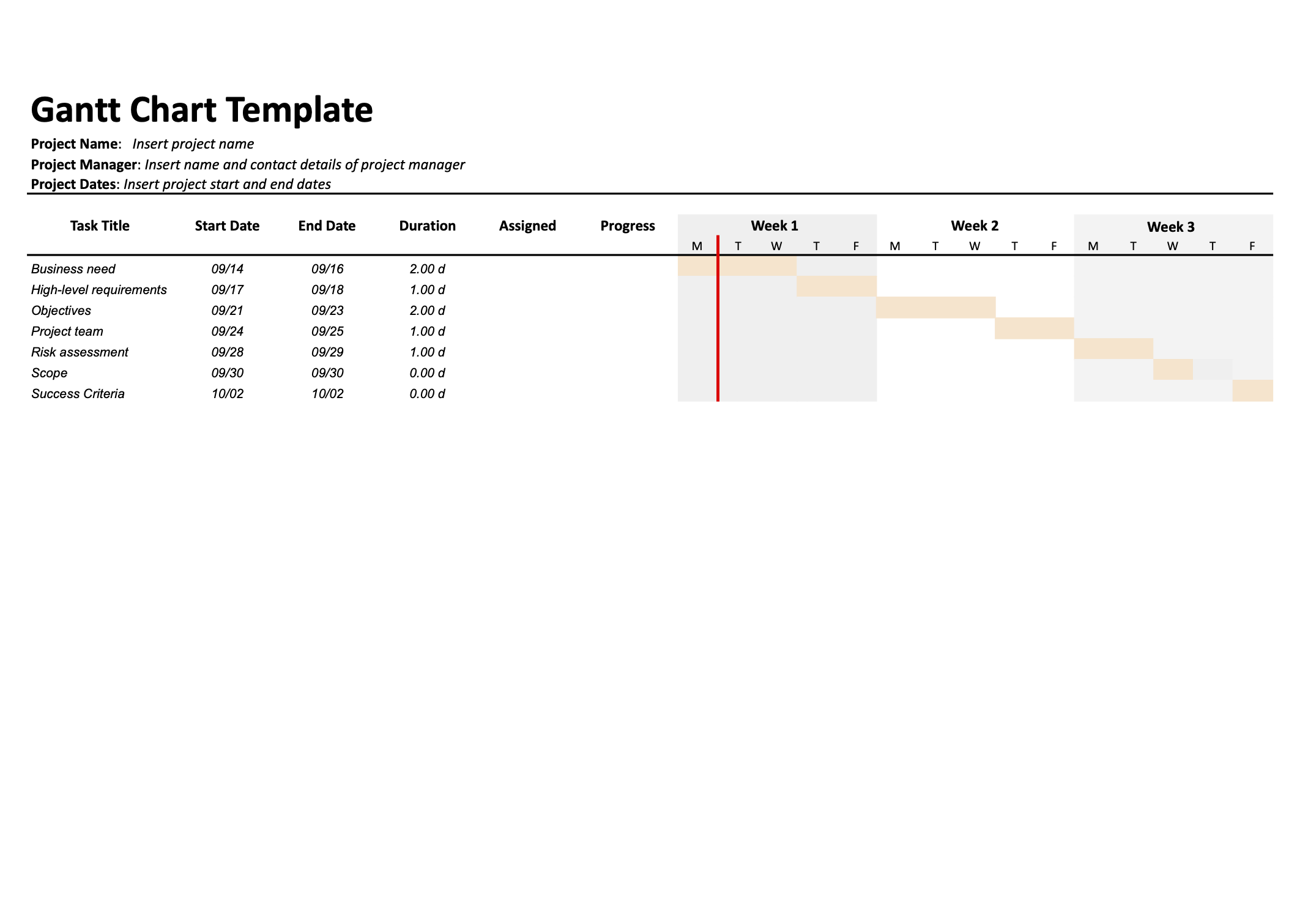
This template contains all the basic features you need from a Gantt chart.
- Task information (left): Displays the task list that drives the timeline. This basic version includes task titles and start and end dates, while more complex templates can add assignees or percent complete if needed.
- Taskbars (right): Taskbars show how long each task takes and where it falls on the project timeline. Their cascading layout makes it easy to spot overlapping work and task dependencies.
- Date line: A bold date line shows where the project should be today. If progress doesn’t align with it, you may need to reallocate resources or address bottlenecks.
- Project overview: For simple projects, this template offers a clear snapshot of planned versus actual progress, making it more effective than task lists or team calendars.
How to read this basic Gantt chart template
This basic Gantt chart template is designed to give you a clear, at-a-glance view of your project schedule. Start by scanning the task list on the left to see what work needs to be done and when each task is scheduled to begin and end. The taskbars on the right show how long each task will take and where it fits on the overall timeline.
Look for overlapping bars to identify tasks that run in parallel, and note how the bars cascade to reveal which tasks depend on others being completed first. Finally, use the date line to compare planned progress with actual progress. If tasks that should be completed according to the date line are still in progress, it’s a signal that timelines, resources, or priorities may need adjustment.
How to use this basic Gantt chart template
- List your project tasks in the left-hand table, including a clear title and start and end dates for each one.
- Group related tasks together so you can see how they roll up into phases or deliverables.
- Once the table is filled in, review the timeline on the right to confirm that task bars reflect realistic durations and logical sequencing.
- Use the date line to compare where you are now with where you planned to be. If tasks that should be complete are still in progress, adjust dates or reallocate effort.
- Update the template regularly as tasks start, finish, or shift so the Gantt chart remains a reliable snapshot of your schedule rather than a one-time plan.
Who should use this basic Gantt chart template?
This simple Gantt chart template is ideal for small teams, short projects, and straightforward workflows where tasks happen mostly in sequence. It works well for one-off initiatives, student projects, internal campaigns, or any project where you need a clear visual timeline but do not require advanced features like complex dependencies or resource management.
Complex Gantt chart template
Sometimes, though, you’ll need a Gantt chart that displays more information to keep you on track.
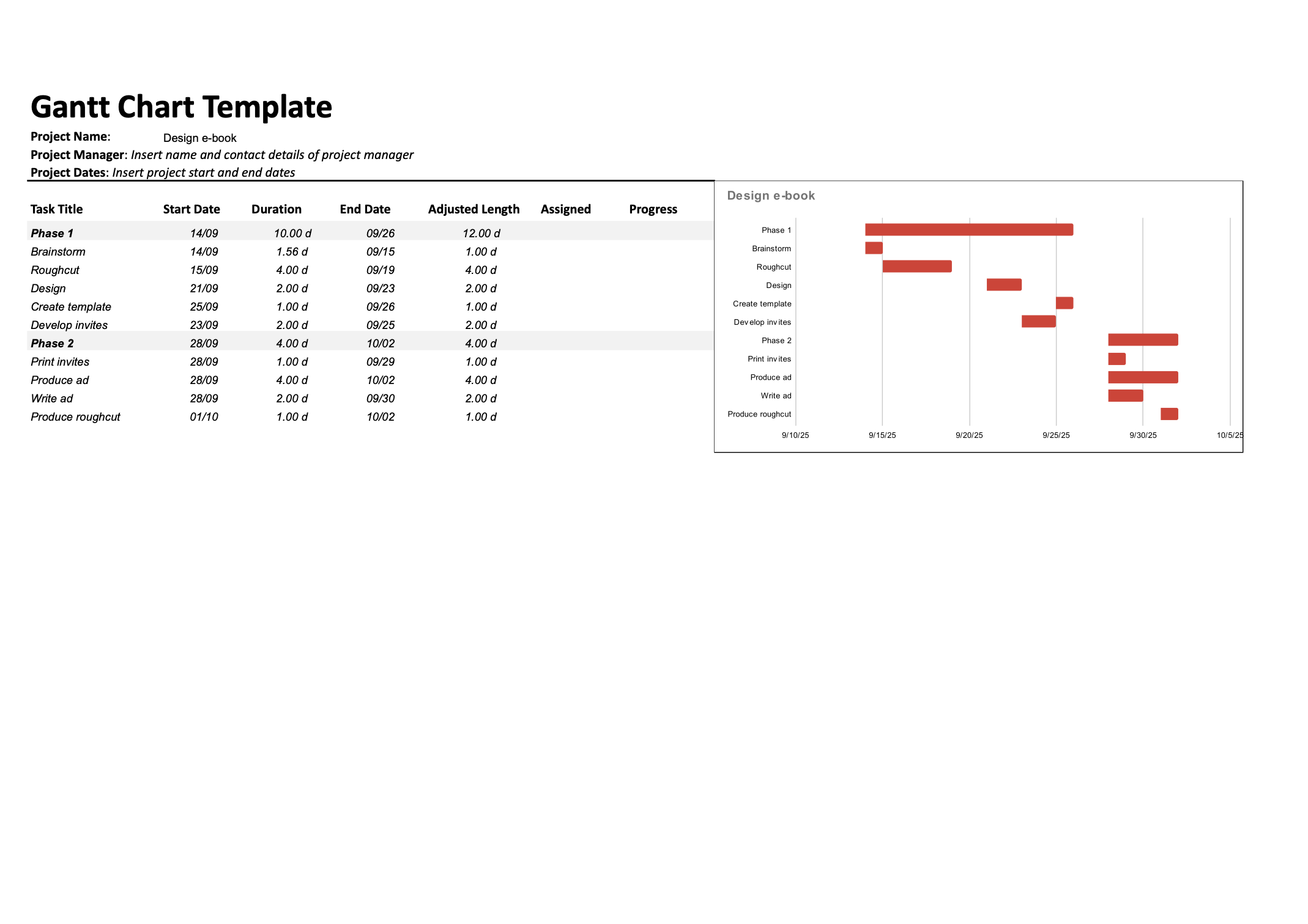
How to read complex Gantt chart templates
For this complex project Gantt chart template, I’ve included more columns in the task information section. As well as the dates and task titles, you can skim this section to see the assignee who’s responsible for the task and the percent completion, which shows how close you are to meeting the goals set by the taskbars.
The work breakdown structure for this project is also more complex. So, I’ve broken it up into phases (marked in the top row), and it’s color-coded.
In my experience, color coding is one of the easiest ways to keep a complex Gantt chart user-friendly. In this example, I’ve assigned colors to the horizontal bars for different subteams (writers, designers, and marketers) and differentiated the overarching objectives (“Design eBook” and “Produce ad,” in strong colors) from the subtasks. You could also color-code your taskbars according to a project’s phase, its status, or whether it’s on schedule or at risk.
But as much as these templates can act as a starting point, I’m sharing them with some caveats.
How to use this complex project Gantt chart template
Start by entering your high-level phases or workstreams in the top rows, then list the detailed tasks and subtasks that roll up into each phase.
- Add start and end dates, assignees, and percent complete for each task so the left-hand table becomes your single source of truth for ownership and status.
- Use color coding to distinguish between teams, phases, or task types, making it easier to scan the chart and understand who is doing what at a glance.
- Review how the task bars align across the timeline to identify overlaps, handoffs, and implicit dependencies. Adjust dates to avoid unrealistic stacking of work on the same people.
- Update percent complete and dates regularly so the chart reflects actual progress against your original plan, and use it in status meetings to guide discussion around risks and bottlenecks.
Who should use this complex project Gantt chart template?
This more detailed Gantt chart template is best suited for larger projects with multiple phases, teams, or parallel workstreams. It is a good fit for marketing campaigns, product launches, implementation projects, and other initiatives where you need to track owners, progress, and dependencies in more depth.
Teams that already work comfortably in spreadsheets and want a more sophisticated view of timing and responsibility will get the most value from this version.
4 drawbacks of free Gantt chart templates
To make sure you get the best possible Gantt chart for your team, let’s look at the pitfalls you need to be aware of if you use Google Sheets, an Excel Gantt chart template, or an online Gantt chart tool.
- Gantt chart templates can become difficult to manage.
- Gantt chart templates aren’t automated.
- Gantt chart templates lack some essential features.
- Gantt chart spreadsheets are designed for project managers.
1. Gantt chart templates can become difficult to manage
It’s a fact of project management that the more information you put in a spreadsheet, the more complicated it is to read and update. Gantt chart templates built on spreadsheets are no exception.
When your project work is complex, or you’re managing a project that will take months instead of weeks, your Gantt chart spreadsheet is going to get wide. It’s easy to get into a position where you have to scroll between the task information and the date line, which makes the Gantt chart extremely difficult to read.
When you’ve chosen a Gantt chart visualization for its simplicity, this situation gets frustrating fast. And when that feeling starts to creep in, you’ll find that your team stops using and updating the Gantt chart, and it becomes an unreliable, unscalable tool.
2. Gantt chart templates aren’t automated
Updating a Gantt chart spreadsheet is a manual, repetitive task. Every time you start a new project, you’ll have to set up a new sheet. Every time your team completes a task, someone has to leave the tool they’re working in, open up the spreadsheet, and make a change. Even something as simple as moving the date line takes multiple clicks.
This system wastes time, and it leaves you open to errors and oversights (which is the last thing you want when you’re trying to track project work). Worst of all, it doesn’t square with the reality of project workflow management.
Your project tasks change status constantly — they’re sent for review, marked as complete, postponed, or added to. They evolve, and every change can have an impact on the length of the Gantt chart taskbars and all the tasks that come after them.
While Gantt chart software can make these updates automatically, it’s incredibly difficult to keep on top of these changes in a Gantt chart template that’s essentially static.
3. Gantt chart templates lack some essential features
Especially for more complicated Gantt charts, you’ll need some features that are tough to add to a spreadsheet. The highly linear examples we looked at above can work well for something like construction projects or event planning, but when you have more tasks happening simultaneously, or more project phases, it’s helpful to have two elements up your sleeve:
- Gantt chart milestones, which are traditionally represented by diamonds
- Task dependencies, which are usually shown as arrows linking the tasks
You can see both of these in this Gantt chart example (made in Wrike): 
4. Gantt chart spreadsheets are designed for project managers
Traditionally, Gantt charts have been a way to give project managers and external stakeholders an overview of the entire project, rather than a tool for the project team that’s working on the tasks.
I’ve already covered the reasons for this — how tough it is to stay on top of updates, the lack of integration with other project tools, and the high chance of human error if everyone on the team is responsible for updating their own tasks.
These problems are more than inconveniences. In practice, they mean that if you use a basic Gantt chart template alone, you might struggle to get your team to engage with project tracking, which leads to:
- More work for managers, who have to create additional documents or updates to explain the information in the Gantt chart to the team
- Information silos, as crucial updates on the project timeline aren’t passed on to the people who need them
- Delays in communication, as team members have to message one another to ask for information, rather than reading it from the chart
- Lack of alignment, as your team can’t use the timeline as a central source of truth
Put simply, the templates above can be a good starting point for your project planning, and I’ve seen them work for one-off projects, very small teams, or teams with very clear accountability for updating the schedule. But, as ever, real project work doesn’t fit into neat boxes. This leaves you with lots of angles to consider, and lots of risks to safeguard against, before you implement Google Sheets or an Excel template for your Gantt charts.
In many, many cases, you’ll be far better off if you skip the Gantt chart templates entirely and consider fully automated, real-time Gantt chart software instead.
Gantt chart templates vs. Gantt chart software
Gantt chart templates are a convenient starting point for simple projects, but their limitations become clear as your work grows more complex. Modern Gantt chart software offers automation, real-time updates, and collaboration features that templates can’t match. Understanding the differences helps teams choose the right approach for their project.
Templates: A quick, lightweight starting point
Gantt chart templates — usually built in Excel, Google Sheets, or PDF — give teams a fast way to create a basic project timeline. They work well when:
- Your project has a small number of tasks
- Dependencies are limited or simple
- Only one person needs to maintain the schedule
- You need a lightweight visual for one-time or short-term planning
Because templates are static, your team will need to manually edit dates, update progress, and adjust dependencies. For straightforward projects, this may be enough, but manual updates become time-consuming as the workload increases.
Software: A dynamic, scalable project planning solution
Gantt chart software automatically generates timelines from your project data and updates the chart as tasks change. This makes it ideal for:
- Multi-phase or long-running projects
- Cross-functional teams that need shared visibility
- Projects with frequent changes or many dependencies
- Organizations that rely on real-time reporting and collaboration
Software handles scheduling logic for you, recalculating task dates when one shifts, adjusting dependencies automatically, and showing progress without manual updates. It also helps teams communicate in context, attach files, assign work, and track accurate timelines without bouncing between spreadsheets.
Which Gantt chart option is best for your team?
If you only need a quick timeline for a small project, a Gantt chart template is simple and efficient. But when your team depends on accurate schedules, shared visibility, and ongoing updates, Gantt chart software provides the automation and reliability needed to manage projects at scale.
A platform like Wrike bridges this gap by transforming static Gantt charts into dynamic, real-time tools that grow with your project and your team.
Game-changing Gantt charts, with Wrike

- Automatically generated Gantt charts unique to every project you track
- Real-time updates to your Gantt charts, based on the latest project data
- Every essential Gantt chart element, from milestones to dependencies, team colors, and more
- Complete integration with your project tools and task tracking, which makes your charts valuable for everyone on your team
Let’s look in more detail at how to replace your Gantt chart templates with Wrike.
Integrate Gantt charts in your project dashboard
When you track your project tasks in Wrike, you can create a Gantt chart from that data automatically. There’s no need to maintain a separate document — you simply add a Gantt chart to your project space, and Wrike updates it for you.
This feature transforms Gantt charts from a dry project management tool to a dynamic overview for your team. Instead of leaving the platform, opening your Gantt chart, and scanning for the information they need, your team members can open the Gantt chart tab at the top of their workspace and view the schedule in real time.
This method connects all the data on your project progress. When you update your Gantt chart, the dates in your Table view and task cards will change to match. When you add a new task to your project space, it will automatically appear on your Gantt chart. And when you need to find out about your tasks in more granular detail, you can drill down into the task history directly from the Gantt chart.
Visualize dependencies and milestones clearly
With Wrike’s Gantt chart tools, you can add task dependencies and milestones to every chart you make.
Adding arrows to display task dependencies is as easy as clicking and dragging. Plus, once a dependency is programmed, the due dates for the subsequent tasks will automatically update if a previous task is delayed. This removes the laborious task of updating each individual taskbar and keeps you alert to changes to your project timeline.
You can even reschedule tasks in bulk.
Milestones are just as simple. All you have to do is click on a task, open the menu, and select “Convert to milestone.” You get a clear overview of the most important upcoming tasks in your project, and you can set up your Wrike workspace to notify you if a milestone task is at risk.
Share and communicate effortlessly
Wrike’s Gantt chart software makes it easy to share your project timeline with anyone who needs to see it. You can:
- Send an automated notification to team members when they’re newly assigned to a task in the Gantt chart
- Generate a link to your Gantt chart and share it easily in an email or message
- Share it as a snapshot with external stakeholders
Save an image of your Gantt chart to share as a status update, project plan, or even a PowerPoint presentation

Import your data for a seamless start
I get it — one of the biggest hurdles to adding a new tool to your stack is transferring your existing data across. With Wrike, the transition to a better Gantt chart system can be smoother and faster than creating a template of your own.
Instead of manually copying your task data, you can import your start dates, task durations, dependencies, and assignments directly from Microsoft Excel or Project to Wrike. They’ll be carried over into your workspace, and then you can add a Gantt chart to your dashboard and hit the ground running.

To get started even faster, you’ll find Gantt charts as the backbone of all these Wrike project management templates:
- Complex Project With Phases template, for when you need to break your work down, track your performance, and continually review your progress
- Adaptive Project Management template, to take you from request management to project retrospective
- Product Manufacturing template, for juggling linear tasks from multiple subteams
- Event Planning template, to ensure success with a clear timeline
- Go-to-Market template, to empower your marketing teams and kick-start your product launch
For next-level Gantt charts, choose Wrike
Your projects depend on your scheduling, and the way you align your team can mean the difference between a successful delivery and a missed deadline. So many companies depend on Gantt charts to get them over the line, but if you’re not taking advantage of the latest tools, you’re settling for bar charts, not dynamic project planning.
When you want a Gantt chart fast, a template can do the trick. But when you need them regularly, Wrike offers some of the best Gantt charts on the market. Our software is robust and scalable, and includes everything you need to build a workspace that works for your team.
See how it works now:
Gantt chart template FAQs
What is a Gantt chart template used for?
A Gantt chart template is used to quickly build a project timeline by filling in predefined fields for tasks, dates, and durations. It helps teams plan work, visualize schedules, and identify potential bottlenecks without building a chart from scratch.
What are the benefits of using a Gantt chart template?
Templates save time, improve consistency across projects, and provide an easy starting point for mapping timelines. They help teams understand task order, estimate durations, and communicate progress more clearly.
What are the limitations of a Gantt chart template?
Templates lack automation, require frequent manual updating, and often cannot handle complex dependencies or shifting schedules. As projects grow, templates become harder to maintain and may lead to outdated or inaccurate timelines.
When should teams stop using templates and move to Gantt chart software?
If your project includes multiple phases, frequent changes, several contributors, or important dependencies, it’s time to upgrade. Gantt chart software streamlines updates, improves accuracy, and helps teams stay aligned in real time.
Can Gantt chart templates support dependencies and milestones?
Some templates allow you to manually mark milestones or draw dependency arrows, but maintaining them is time-consuming. Software automatically adjusts downstream tasks, updates milestones, and prevents errors caused by manual changes.
How does Gantt chart software like Wrike improve project management?
Wrike automates schedules, updates task bars in real time, and centralizes ownership, progress tracking, and communication. With built-in dependencies, milestones, resource management, and team collaboration tools, Wrike provides accuracy and visibility that static templates cannot match.
What features does an Excel Gantt chart template offer?
An Excel Gantt chart template provides a simple, visual way to plan and track projects without complex tools. It allows teams to map start and end dates on a timeline, plan work across days, weeks, or months, and visualize how tasks connect using dependency lines or arrows. Excel Gantt charts can also include milestones to measure progress and are often color-coded to show whether tasks are complete, on schedule, or late, making project status easy to understand at a glance.
What features are included in a Google Sheets Gantt chart template?
A Google Sheets Gantt chart template helps teams create a centralized overview of project timelines, tasks, and progress. It typically includes project timeframes, status update columns, and visual progress indicators. Color coding can be used to highlight task status — such as active, in progress, or complete — giving teams real-time visibility into progress and helping them manage timelines, resources, and stakeholder expectations more effectively.