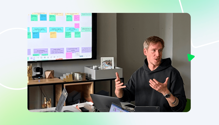
Hi, I’m Mark Veldhuizen, one of the creative minds behind the Klaxoon platform and a Product Manager here at Wrike. I’ve been with Klaxoon since the beginning and have seen how critical it is to bake engaging design into an engagement platform right from the start.
Today, I’ll give you a behind-the-scenes look at how we made Klaxoon a powerful and unique visual collaboration tool that users genuinely love using, with a strong emphasis on participation and engagement. I’ll also talk about how you can implement this same strategy into your own product design.
The 3 levels of engagement design
To understand how engagement is built into a product’s DNA, we can look at the three levels of emotional design theory. Every successful product, especially those built for collaboration, should consider all three:
- Visceral design: This is the immediate, subconscious level, essentially the first impression. It covers aesthetics, color, and direct emotional appeal. Visceral design dictates the mood, letting the user know if they should feel comfortable, energized, or intimidated upon logging in.
- Behavioral design: This is the practical level, focusing on usability, performance, and function. Its goal is simple: to ensure a user can accomplish tasks easily and efficiently. Good behavioral design makes complex actions intuitive and completely friction-free.
- Reflective design: This is the deepest, longest-lasting level, encompassing the cultural and intellectual impact of the tool. It involves the user’s conscious memory, overall satisfaction, and how the product affects their self-image. Reflective design builds loyalty and determines whether the user feels truly empowered by the tool over time.
The foundation: Engagement first, whiteboard second
As lead designer working on the platform since 2015, I experienced a core conviction firsthand: If your tool is geared toward helping others collaborate and engage, the tool itself must inherently be engaging.
Klaxoon didn’t start as a whiteboard. Back then, it was a suite of tools built to increase participation in training materials and meetings, making them more dynamic and participatory. We were stepping into an undefined market, dominated by corporate presentation tools that drove all meetings in a top-down, quite drab, and overly formal way.
Our visual whiteboard, Board, was just one activity among many (alongside Quiz, Survey, and Adventure) in an engagement suite that we developed to offer teams a new way to drive meetings and training efforts.
Because of this context, Board was designed not just to digitize sticky notes — it was built for participation to thrive, designed to be enjoyed and used. This fundamental difference guided all our early product bets.
The power of the unexpected: Designing for emotional attachment
We quickly became known in France’s corporate world for defying industry norms. We made a big design bet on emotional design, which truly set us apart: embracing color and personality in a way B2B products simply didn’t. Our hot pink branding and the horn symbol were intentional choices designed to challenge stiff corporate codes. The horn symbolized making noise, being heard, and allowing anyone to reach out and “HONK” to make their input visible.
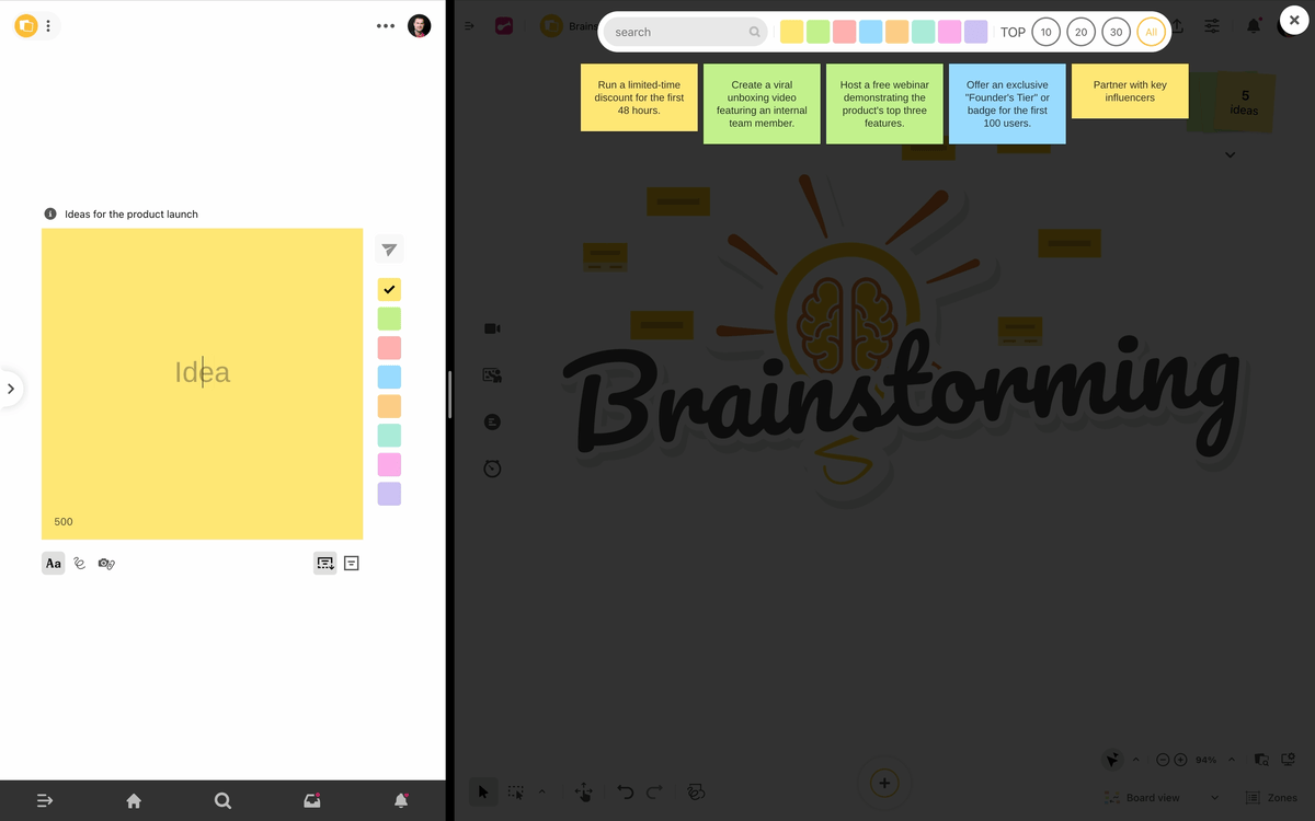
Our first visceral design choice was simple but strategic: While many competitors used a standard gray backdrop, we chose to make the whiteboard canvas pure white. Our “idea” sticky notes were designed with pastel but slightly vibrant tones. This allowed the infinite canvas and the user-created content to really pop, making other whiteboards look, well, a little boring in comparison.
We then took the bold step of using huge swaths of colorful backdrops across Klaxoon, lots of hot pink, and bright, primary color palettes. I remember some of France’s biggest, most serious CAC40 companies holding executive workshops where they’d see huge, colorful word clouds bubbling up in real-time on a vast, pink background. And do you know what we discovered? People were enjoying it, and participation was high.
This emotional design, being different and brave with color, was key. It signaled to the user, “Klaxoon isn’t your usual corporate software; this is a space for creativity and play.” This led to end users and company ambassadors becoming superfans — emotionally attached to the brand and product that drove engagement and internal adoption.

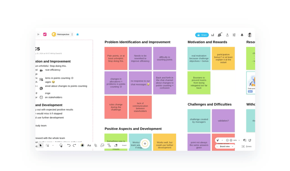
The sticky note as the participation catalyst
The second major design bet we made was on behavioral design, making the participatory action the easiest one. For us, that meant making the sticky note the single most central, important object on the Klaxoon board.
In many whiteboarding tools, the sticky note is just one of many tools. In Klaxoon, the entire user experience prioritizes the use of sticky notes above all else. We actively streamlined the UI to discourage the use of complicated objects or boring, plain text boxes. In fact, Klaxoon can be configured so that the only thing participants can do is send sticky notes, simplifying the input and removing distractions.
The result is a digital board that is visually simple, colorful, and closely resembles a real, thriving whiteboard. Furthermore, the sticky note unlocks powerful features: It can be combined with Question (the polling tool), dot-voting, and even carries over into the Wrike integration, where imported Wrike work items live inside the sticky note. This design choice created simplicity and boosted participation by making idea-sharing frictionless. From idea to action.
Instant interaction: The ‘Question’ as a feedback engine
This focus on participatory mechanics extended beyond the whiteboard. A key example is our Question tool: a toolbox of highly interactive, real-time activities like polls, challenges, and word clouds.
While other platforms often include some level of polling, these features were typically an add-on or an afterthought, such as a simple button to record a vote. In contrast, Questions in Klaxoon were designed from day one to promote maximum engagement and to be central to the experience.
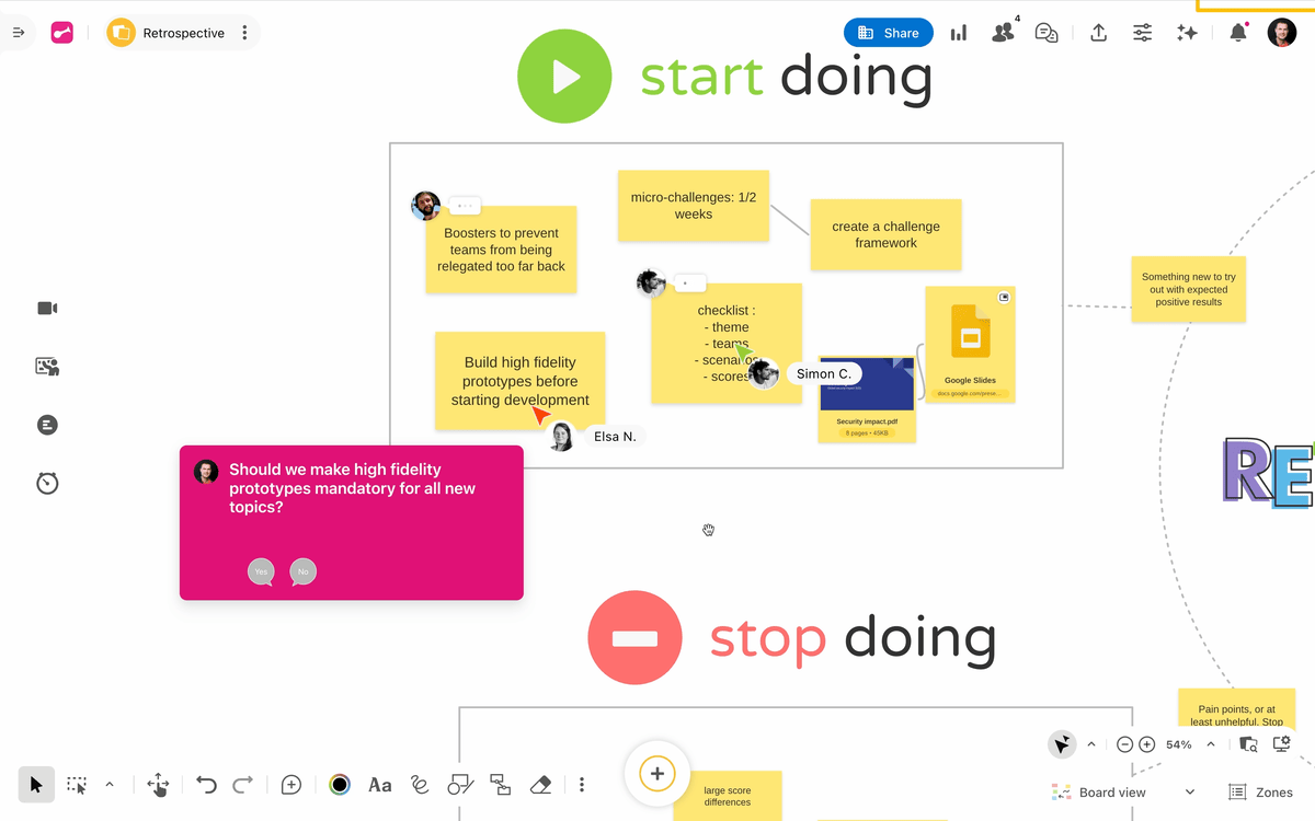
Going from idea to action is the critical step that most platforms miss. Our Question tool provides the mechanism to drive decision making. This achieves alignment or reaching a consensus, which actually creates a way to clearly document decisions made within the board, instead of having them hidden within a comment thread.
In just a few clicks, a facilitator can create a “Yes/No” poll and have it automatically appear on everyone’s screen. As participants answer, they see instant, down-to-the-millisecond visual feedback: colors shifting, bars growing, and speech bubble sizes changing in real time to reflect the group’s pulse. This immediate, kinetic feedback loop transforms a simple data collection exercise into an energetic, rewarding experience that everyone enjoys using. We didn’t build a tool to count votes; we built — and are continually building — a highly visual and interactive feedback engine.
A lesson in ergonomic evolution
Our initial commitment was to universal participation, meaning that back in 2015, we were completely and unapologetically mobile-first at a time when most corporate tools were unusable on a phone.
This was great behavioral design at first: being able to scan a QR code with a phone to instantly participate in a meeting or event did wonders for engagement. However, when the world shifted to laptop ubiquity during the pandemic, and digital whiteboards also became the standard everywhere, our mobile-centric designs, like the bottom-central “+” button, became frustrating. This clunky desktop experience was a lesson in how rapidly poor ergonomics can trigger a negative emotional response.
This story reminds us that while the philosophy of participation is timeless, the specific behavioral design choices that deliver it must evolve with user context. We are now addressing these shifts with a complete overhaul of the Board’s interface to fix past ergonomic issues, ensuring that the DNA of Klaxoon — on engagement and emotional attachment — is still key and will be as present as ever.
Final takeaway: Building a product people love
The story of Klaxoon’s design evolution is a simple one: If you want people to engage with others, you must first engage them with your product.
As visual collaboration becomes ubiquitous, the battle for a product’s success will be fought not just on features, but on how it makes people feel.
The ultimate aim of our design choices was to ensure users felt: “I was heard,” “My idea contributed,” and “I helped shape the outcome.” This sense of agency drives reflective loyalty.
The challenge for product teams today is to review their platforms across three key levels: visceral (how it looks and feels), behavioral (how it functions and flows), and reflective (the long-term emotional connection and sense of belonging). Ask yourself:
- Is our design brave enough to be loved? (Visceral)
- Are our core actions intuitive and efficient? (Behavioral)
- Does our tool empower users and build lasting loyalty? (Reflective)
By building a genuine emotional connection from the start, you not only create a superior user experience but also forge a loyal user base ready to champion your product, regardless of the competition.
If you’re interested in putting Klaxoon’s engagement features to work with your team, book a Klaxoon demo today. If you’re already a Wrike user, you can try Wrike Whiteboard, powered by Klaxoon, by getting in touch with your Wrike admin.