Key takeaways:
- What makes a project management office (PMO) dashboard different from a standard project dashboard? A PMO dashboard focuses on strategic alignment and portfolio-wide performance, not just task-level progress. It serves executive decision making by tracking long-term objectives (like objectives and key results, or OKRs for short), resource distribution, and portfolio health across departments — unlike project dashboards, which are more focused on short-term execution and team-level outputs.
- Why key metrics should a PMO dashboard include? Common metrics include the number of active and at-risk projects, portfolio budget utilization, average cycle time, time to value, and customer satisfaction. The most effective dashboards align these indicators with strategic goals to offer a clear view of how project outcomes support broader business objectives.
- How can PMOs ensure their dashboards remain effective over time? PMO dashboards should be adaptable. As business strategies evolve, the dashboard must allow for real-time updates, customizable widgets, and integration with project and financial tools. Regular refinement based on feedback and performance insights helps keep the dashboard aligned with organizational goals decision-making needs.
It’s easy to search for PMO dashboards online, but much harder to find one that’s actually built with the needs of a project management office in mind.
The problem is, there’s a world of difference between project management (PM) and the project management office (PMO). One is focused on the day-to-day progress of a team’s initiatives, while the other looks at how the whole portfolio works toward a company’s long-term strategic goals.
So, while PM and PMO dashboards might display some of the same data, they ultimately need to show it in different ways if they’re going to be successful.
In this post, I’ll show you what you need to do to differentiate your PMO dashboard from your standard project overviews. Plus, I’ll demonstrate how to build a dashboard in Wrike that truly keeps you on track to meet your company’s goals.
With the right dashboard tools in place, your PMO has wider visibility, better alignment between projects, and a real-time, interactive overview of its critical OKRs, all while saving time and improving communication within your organization.
Let’s look at how it’s done.
What makes a PMO dashboard unique?
The difference between a PMO dashboard and a standard multiple-project dashboard comes down to four things:
- What it tracks: Project dashboards show progress toward project goals, and project portfolio dashboards do the same for groups of projects. But a true PMO dashboard shifts focus to wider, longer-term strategic goals. Think about objectives and key results for ambitious, top-level goals for the company, rather than key performance indicators for the steady, ongoing progress in your projects.
- The timescale it covers: Dashboards for project managers are used to inform short- to medium-term decisions, like delegating tasks to team members, scheduling project milestones, and prioritizing tasks for an upcoming sprint. On the other hand, PMO dashboards show the way entire project portfolios are trending, and support decisions about where to steer the business as a whole.
- The volume of data it deals with: While project dashboards can centralize a lot of information about project tasks and team members, PMO dashboards need to pull this information, and more, from across an entire organization. With so many potential success metrics to track, PMO dashboards have to be incredibly robust if they’re going to turn this data into clear, actionable insights for the office.
- The audience: Put simply, project dashboards are for project teams to help them prioritize their work and execute their projects. In contrast, PMO dashboards inform the company’s leadership team and portfolio managers. Ultimately, those are the boards that decide how to share resources between departments, which projects to pursue, and how to shape the company’s strategy for months and years to come.
This means that a true PMO dashboard needs to condense a broad swathe of information into actionable, informative insights. It’s not just a snapshot of what teams are assigned to which projects, overdue tasks, and remaining budget; it’s a way to measure progress and get to the root of the performance issues that jeopardize the goals.
When you bear that in mind — and choose metrics to match — you can build a PMO dashboard that illuminates the decisions you have to make.
What to include in a PMO dashboard
There are countless ways to configure a PMO dashboard, and Wrike helps you customize your OKR tracking and build the most effective overview for your company. With integrations with your team’s project management tools and the option to adjust your tracking widgets as your priorities shift, you can build a dashboard that’s as unique as the projects you need to track.
This being said, I’ve seen a lot of examples of PMO dashboards, and there are some clear patterns in their key performance indicators (KPIs) and how they display them.
Time and again, PMOs choose a combination of these metrics as the best way to show how their current projects are aligning with their OKRs.
- Total number of projects
- Number of overdue or at-risk projects
- Overall status or health of the portfolio
- Project prioritization scores
- Average cycle time
- Time to value or time to impact
- Customer satisfaction scores
- Portfolio finances and budget utilization
For example, if your company’s objective is to improve project delivery times, the average cycle time gives you a concrete measure of the results. When you also show the number of at-risk projects in your dashboard, you can see where to focus your attention if you’re going to meet your goals for the next quarter.
Or, imagine your company wants to improve its financial management. In this case, your PMO office can monitor the total spend to see if you’re on track for your targets, and the remaining budget to see if you can feasibly complete your scheduled projects with the funds you have left.
I’ve also seen companies use PMO dashboards when they transition to a new style of project management, like switching from a linear to a cyclical Agile methodology. If this sounds familiar, you can use your dashboard to display metrics like team velocity, satisfaction survey results, and time to value. These KPIs will show if the new methodology is working as planned.
It’s worth noting that PMOs are often tasked with evaluating key results in all the areas I laid out above. This makes it even more important to be intentional about the key metrics you include. You can also consider ways to divide your dashboards into sections to organize the information as clearly as possible.
For inspiration, I’ve found four examples of PMO dashboards — all put together and automated in Wrike — that show different ways to monitor project performance metrics according to a company’s OKR framework.
Example 1: OKR portfolio overview dashboard
This dashboard brings together the headline financial metrics being tracked by the company’s PMO. 
- At the top, the PMO can see at a glance how much of the budget has been spent and how much remains.
- In the pie chart, the PMO can check where that budget was allocated, as they’ve displayed it in connection with the key results they’re tracking.
- Then, in the bar chart, the PMO can compare the planned to the actual spend, again in the context of the company’s strategic goals.
At the bottom of the dashboard, this data is displayed again in connection with the individual projects, rather than the OKRs. Helpfully, the dashboard also color codes the project status, which gives the PMO an insight into the projects that might need additional funding to get them over the line.
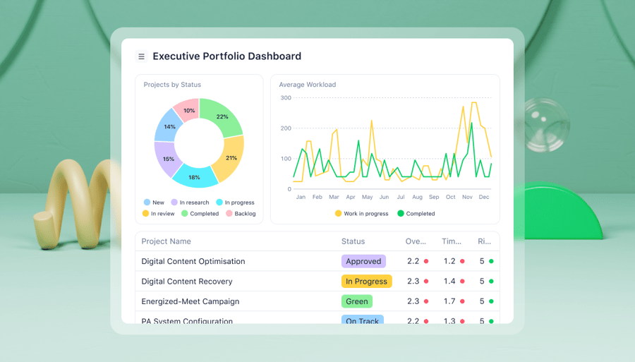
Example 2: Executive portfolio dashboard
The executive portfolio dashboard helps the PMO monitor portfolio progress, keeping the company’s executives up to date and optimizing resource management. 
This dashboard also supports smart decision making regarding resource allocation for the remaining and future projects. It shows the team’s completed work and how their workload fluctuated over the previous 12 months. This metric can help the team make informed decisions about project scheduling, staffing, and the types of projects to pursue in the upcoming quarter.
Example 3: Results-based OKR dashboard for portfolio evaluation
This dashboard focuses on the results of the projects, rather than their progress, as a way of measuring strategic alignment. It’s a great example of including recently completed projects in the dashboard as a benchmark. 
I’m also a fan of the team calendar widget this company has added to their PMO dashboard. This helps streamline communications between the PMO and project managers, as it gives them an idea of what each team has on their plates before they reach out to discuss new approaches and risk management strategies for the ongoing projects.
Example 4: Project allocation dashboard for accountability
Finally, this dashboard is not just about monitoring; it also gives live alerts to inform the PMO’s communications with the project managers they need to touch base with. 
This is complemented by the live activity stream on the dashboard, which helps the PMO monitor the changes to the project statuses. It also acts as a quick way to ensure that the action points they’ve discussed are being carried out, without them having to take time to email the PMs to ask for an update.
How to build a PMO dashboard in Wrike
By now, it should be clear that the best PMO dashboards aren’t usually found in Excel spreadsheets, lists, or simpler project management dashboard tools.
When you’re ready to upgrade your dashboards and help your PMO work effectively, Wrike is best placed to help you meet your goals.
Our work management software is designed for enterprises and the massive amount of information that needs to be tracked and analyzed in these companies. That’s why we’ve set up our robust PMO dashboard system to monitor and display information on your entire project portfolio — from across multiple departments — in dashboards tailored to your OKR framework and your PMO.
When your project managers track their work in Wrike, our system gathers data from their workflows, including completion times, information on the project complexity, scheduling data, bottlenecks, team capacity information, and more. As well as giving them a visualization of their project progress, this same live data translates into a separate PMO overview.
This is the most reliable, most streamlined way to improve the decision making that happens in your project management office and beyond.
Here’s how you can get started today.
Step 1: Identify the goals and objectives
The core purpose of a PMO dashboard is to show how your project outcomes align with your strategic goals. So, when it’s time to put your dashboard together, you’ll need to know:
- The current objectives your company is working toward
- The time frame you’ve been given for achieving those goals
- The KPIs you’ll use to measure your progress and project your results
If your company already operates a PMO, I’ll bet that you already have access to a document laying out the company-wide objectives you’re working toward, and you’re probably more than familiar with strategic planning techniques like SWOT and PESTLE analysis. Still, if you’re not at that point yet, or you need tips for setting long-term goals and articulating them to your teams and stakeholders, check out Wrike’s Goal Setting Guide. 
Remember, Wrike’s dashboard system is adaptable. If your goals change later, or if you find you’re not getting all the information you need from the first KPIs you track, you can adjust the filters, add custom widgets, or rearrange your dashboard at any time.
Step 2: Build the dashboard in your Wrike PMO space
As soon as you start tracking project tasks in Wrike, you can set up a PMO dashboard to oversee them.
This first step only takes a couple of clicks: open your Wrike workspace, create a new dashboard, name it, and assign it to a PMO space. Our most popular business plan includes unlimited dashboards and many of the planning and reporting features that bring PMO dashboards to life.
Wrike’s dashboard system is built on widgets. These widgets filter the latest information from your central workspace — and that’s the real beauty of the system. Instead of pulling project progress data from reports from different departments, cross-referencing it manually, and populating a dashboard by hand, your teams track their tasks as they work, and Wrike automatically updates your overview. This helps you strategize with the latest information available, with insights from across your organization, which is perfect for the project management office.
Wrike includes preconfigured advanced reporting widgets, which you can use as a starting point for your dashboard. For example:
- Pivot table summarizes and analyzes large amounts of data
- Table with breakdowns displays a broader view of your data in columns
- Indicator gauges where your current KPI value sits between two numeric values, like a dial showing your budget utilization
- Calendar heatmap visualizes values over days, weeks, and months, so you can identify patterns or anomalies
- Funnel chart shows the stages in a process, to track sequential data as you move through a series of steps
You can also add diagrams like pie charts, bars, columns, line graphs, scatter maps, and sunbursts to make it easier to interpret your project progress data at a glance. 
Before you launch your PMO dashboard, you can also adjust the dashboard permissions to keep your data secure.
While the role of the PMO is to liaise with project managers and executives, there are plenty of reasons to keep your PMO overview private. If you want to limit access, for example, to keep information on projects for different clients private, you can invite team members individually and toggle permissions between four different access roles: full, editor, limited, and read-only.
Step 3: Adapt your dashboard
The true strengths of Wrike — and the reasons our software works so well for PMO — are its scalability and flexibility.
When you start using your new dashboard to track your performance, you will find something you can improve. Maybe your team will have a suggestion in a feedback meeting about the new system. Maybe you’ll notice a gap in your overview, or an area where your results aren’t improving despite in-depth monitoring and analysis. Maybe your business strategy will simply change.
When this happens, Wrike grows and evolves with your team. Simply adjust the widgets and filters on your dashboard to reflect your objectives more closely, and Wrike will present the latest data automatically.
As you become more confident at managing your PMO with Wrike, you’ll also find opportunities to integrate more of your tools and view your work in more detail. For example, Wrike includes integrations with financial management platforms like QuickBooks, and it can also be integrated with most popular HR tools and CRM systems.
Wrike’s dashboards are intuitive and easy to learn, and upgrading your PMO workspace can be as simple as adding a new template, like these:
- OKR template to simplify strategic planning, clarify goals, and track your progress on the individual, team, and company level
- Go to market strategy template to optimize workload, timelines, and resource allocation in marketing companies
- Business goals template to clarify your company vision, communicate your objectives to your team, and track crucial milestones at a glance
Strategic, data-driven decisions with Wrike’s PMO dashboards
Wrike is easy to use, fully customizable, and completely scalable. Put simply, it’s the best choice for your PMO and every level of your management team.
Wrike’s dashboards and PMO features accelerate:
- OKR planning, to de-risk your company’s strategic decisions, visualize your objectives, and align your project plans
- Agile execution, with high-level and granular views of your project data to support this management style
- Governance, getting everyone on the same page by standardizing and tracking your business processes
- Portfolio management, with project portfolio management features to keep you in complete control of even the most complex portfolios
- Resourcing, with tools to calculate your needs, assess your capacity, and balance resources across your project teams
- Reporting and visibility, by transforming valuable analytics data into detailed, tailored, real-time reports
Find out more about Wrike’s PMO features and resources here, or start your free trial today.