
8 Project management charts (types, when to use, and examples)

Project data is often just noise until you give it a structure. Charts act as a visual framework, turning abstract plans into clear views of your scope, schedule, and workflow. By mapping out roles and performance metrics, these visuals eliminate the guesswork, ensuring everyone knows exactly where the project stands without digging through endless spreadsheets.
Different phases of a project require different perspectives. You might need a Gantt chart for long-term planning, then switch to a Kanban board for daily tasks or a calendar for deadline tracking. Having the flexibility to toggle between these views ensures you’re always seeing the most relevant information.
In this guide, we’ll break down the most effective project management charts and when to use them. From identifying the right visual for your team’s needs to streamlining your delivery process, here is everything you need to transform your raw data into an actionable roadmap.
How to choose the right project management chart
Choosing the right chart isn’t about finding the best one; it’s about matching the visual to the specific question you’re trying to answer. To pick the right framework, identify your primary goal for the current phase of your project.
- Need to see the schedule and dependencies? Use a Gantt chart, network diagram (PERT), or critical path method (CPM) to map out the timeline and find bottlenecks.
- Need to manage daily workflow and status? Use a Kanban board to visualize work in progress and move tasks from “To-Do” to “Done.”
- Need a clear scope breakdown? Use a work breakdown structure (WBS) to decompose large deliverables into manageable chunks.
- Need to define roles and accountability? Use a RACI chart to clarify who is responsible, accountable, consulted, and informed for every task.
- Need to track delivery trends (like in Agile teams)? Use a burndown or burnup chart to monitor how quickly your team is completing work compared to the remaining effort.
The “pick in 30 seconds” checklist
If you’re still stuck, use this quick checklist to decide:
If the challenge is... | Use this chart |
Strictly timeline-driven | Gantt chart |
Team overwhelmed by volume | Kanban board |
Role confusion (who does what?) | RACI chart |
Scope is too big/vague | Work breakdown structure (WBS) |
Worried about the launch date | Critical path method (CPM) |
1. Gantt chart
At its core, a Gantt chart is a visual timeline that uses horizontal bars to represent project tasks. It maps out your entire project lifecycle from start to finish, showing how long each task should take and how they all stack up against one another.
Here is a breakdown of when and why to use this project management staple:
- What it shows: Individual tasks plotted against a calendar, including their duration, start/end dates, major milestones, and overlapping work. Crucially, it also visualizes dependencies — those if/then links where one task can’t start until another finishes.
- Best for: Projects with firm deadlines and multiple moving parts. It’s the go-to for cross-team coordination because it shows how one person’s delay impacts everyone else’s schedule.
- Avoid when: You’re dealing with high-velocity, reactive work that changes by the hour. If your team isn’t committed to updating their progress, a Gantt chart quickly becomes an outdated (and misleading) relic.
- Example: A marketing launch plan where the “go-live” milestone depends on the “final asset approval,” which itself depends on the “creative design” phase.
2. Kanban board
A Kanban board is a live map of your team’s capacity. It uses cards to represent individual tasks and columns to represent the stages of your workflow — traditionally "to do," "in progress," and "done." This layout allows anyone to see, at a glance, where work is piling up and where it’s flowing smoothly toward the finish line.
- What it shows: Real-time task status, work-in-progress (WIP) levels, and process bottlenecks. It visualizes the journey of a single piece of work from the moment it’s requested to the moment it’s delivered.
- Best for: Continuous workflows, Agile teams, and visual thinkers who need to manage a high volume of tasks without getting bogged down by rigid calendar dates. It’s excellent for improving team transparency and focus.
- Avoid when: You have highly complex, multi-layered dependencies where Task A must finish before Task B can start. For those scenarios, a Gantt chart is a much safer bet.
- Example: A content production queue where articles move from “writing” to “editing” to “graphic design” and finally “published.”
3. Work breakdown structure
If a project feels too massive to wrap your head around, a work breakdown structure (WBS) will be your best friend. It’s a hierarchical decomposition of the total scope, starting with the final deliverable at the top and branching down into smaller, manageable work packages. It doesn’t worry about dates or sequences yet; it simply defines the “what” of the project to ensure nothing is forgotten.

-
What it shows: A top-down view of the project scope, breaking the main goal into sub-projects, tasks, and sub-tasks. It visualizes the relationship between the final product and every contributing piece of work.
-
Best for: The initial planning phase of complex projects, where you need to clearly define the scope and provide cost or time estimates for specific segments.
-
Avoid when: You’re working on a small, straightforward project or one that is purely process-driven. Over-mapping a simple task list can lead to unnecessary administrative bloat.
-
Example: Developing a new mobile app. The top level is the “launch-ready app,” which branches into “front-end design," “back-end architecture," “API integrations,” and “QA testing” — each containing specific, finite deliverables.
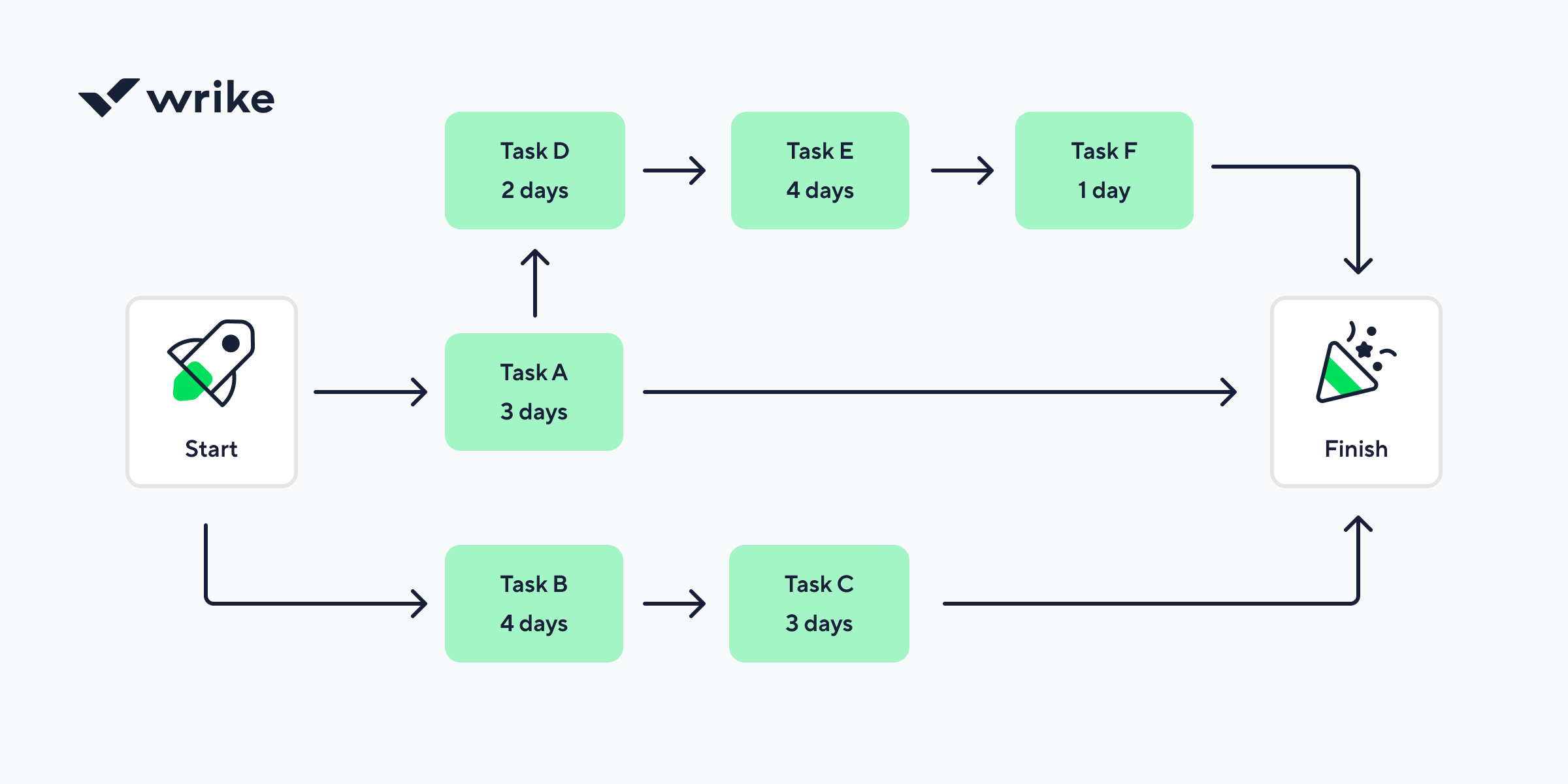
4. PERT chart
A program evaluation and review technique (PERT) chart is essentially a roadmap for the what-ifs of a project. Unlike a Gantt chart, which focuses on dates, a PERT chart is a network diagram that visualizes the relationship between tasks.
It’s designed to help project managers estimate the minimum time needed to reach the finish line, accounting for uncertainty by calculating the optimistic, pessimistic, and most likely timeframes for every piece of the puzzle.

- What it shows: The flow of milestones and tasks in a non-linear network. It highlights the sequence of events, any task dependencies, and the critical path.
- Best for: Complex, large-scale projects where timing is uncertain, or tasks are highly interdependent. It’s a powerful tool for resource planning because it identifies which tasks are blockers and which have a little slack time.
- Avoid when: You’re managing a simple project with a predictable timeline. The time it takes to build and maintain a PERT chart is only worth the effort when the project’s scale or risk level justifies a deep statistical dive.
- Example: A corporate merger integration. Because hundreds of tasks, from legal audits to IT migrations, rely on one another and have unpredictable durations, a PERT chart helps pinpoint exactly which delays will push back the final closing date.
5. Critical path method (CPM)
The critical path method is a strategy for survival when you’re up against a tight deadline. It identifies the longest sequence of dependent tasks that must be completed on time for the entire project to finish.
By uncovering this path, you can distinguish between tasks that have some float (wiggle room) and those that, if delayed by even an hour, will push back your final delivery date.
- What it shows: The specific chain of tasks that directly controls the project’s duration. It visualizes dependencies and calculates slack time for non-critical tasks, allowing you to prioritize resources where they are needed most.
- Best for: High-stakes projects with rigid end dates. It’s essential for project scheduling when you need to know exactly which tasks are non-negotiable and where you can afford a minor delay without jeopardizing the launch.
- Avoid when: You are working on a creative project with a fluid scope or an Agile project where priorities shift every two weeks. If the sequence of work isn’t predictable, the path will change too often to be useful.
- Example: A major product redesign. If “user testing” and “final code review” are on the critical path, any delay there means the product won’t ship on time, whereas a delay in “writing the internal wiki” (a non-critical task) might not impact the launch date at all.
6. Milestone chart
Sometimes, your stakeholders don’t need to see every granular task; they just want to know if the project is hitting its big goals. A milestone chart is a high-level summary that strips away the day-to-day noise to focus on key dates and major achievements.
It’s essentially a timeline populated with diamond-shaped markers that represent the checkpoints or turning points in a project’s lifecycle.
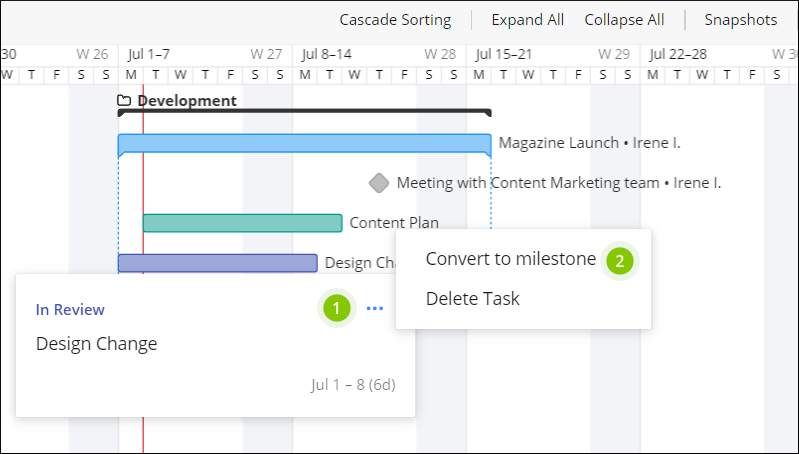
- What it shows: Key dates, major deliverables, and significant events without the clutter of individual sub-tasks. It visualizes the transition from one phase of a project to the next.
- Best for: Executive reporting and stakeholder meetings. It’s the perfect tool for keeping high-level sponsors informed of progress without overwhelming them with technical details.
- Avoid when: You are actually managing the work. A milestone chart doesn't show dependencies or workload, so it’s useless for a project manager trying to figure out why a specific team is falling behind.
- Example: A software development roadmap. Instead of showing every bug fix, the chart features "beta version release," "security audit complete," and "public launch."
7. Burndown and burnup charts (for Agile teams)
In the world of Agile, speed and momentum are everything. Burndown and burnup charts are the speedometers of your project. A burndown chart shows how much work is left versus the time remaining in a sprint, while a burnup chart tracks the total work completed against the total project scope.
Together, they provide a transparent look at whether your team is on pace to hit their targets or if the scope is growing faster than you can keep up with.
- What they show: The relationship between time and effort. A burndown chart focuses on the remaining "to-do" list, while a burnup chart highlights "scope creep" by showing how the total amount of work has changed over the course of the project.
- Best for: Agile and Scrum teams who need to track their velocity, the rate at which they complete tasks, to predict future performance and manage stakeholder expectations.
- Avoid when: You have a fixed-scope project with very little change. If the work is static and predictable, a simple progress bar or Gantt chart is usually sufficient.
- Example: A two-week software sprint. The burndown chart helps the Scrum Master see if the team is at risk of not finishing their committed stories by Friday, prompting a mid-week adjustment.
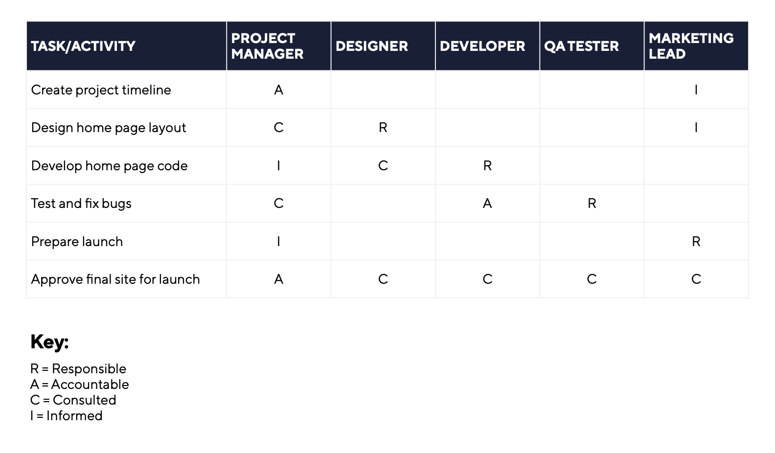
8. RACI chart
A RACI chart is also known as a responsibility assignment matrix. It focuses entirely on people and ownership rather than deadlines. This grid maps out every task or decision against the specific team members involved. By assigning roles like “responsible,” “accountable,” “consulted,” or “informed,” you can prevent the confusion that often leads to missed deadlines or duplicated work.
Common mistakes when using project management charts
Visualizing your data is supposed to make life easier, but it is surprisingly easy to turn a helpful chart into a source of frustration. Even the most experienced teams fall into these traps when they focus more on the look of the chart than the actual work it represents.
- Picking the wrong chart for the job: Using a Gantt chart for a creative brainstorm or a Kanban board for a highly sequenced construction project creates unnecessary friction. Always match the visual to the specific problem you are trying to solve.
- Building fake timelines in Gantt charts: A Gantt chart without dependencies is just a glorified calendar. If you do not link tasks, you lose the ability to see how a delay in one area ripples through the rest of the project.
- Treating charts as static documents: A project chart is a living document. If you only update it once a month before a big meeting, it is already obsolete. Charts should reflect the current reality of your project, not a best-case scenario from three weeks ago.
- Over-detailing every single task: There is a fine line between clarity and clutter. If your work breakdown structure or Gantt chart includes every five-minute phone call, the big picture gets lost. Focus on major deliverables and milestones to keep the view actionable.
- Using charts to micromanage instead of coordinate: Charts are meant to empower teams by providing transparency. If you use a Kanban board or RACI matrix to hover over every minor move a team member makes, you will crush morale and slow down the very workflow you are trying to optimize.
Final thoughts
The most successful projects are not usually the ones with the most complex diagrams. Instead, they are the ones where every team member actually understands the plan. Whether you are mapping out a multi-year roadmap on a Gantt chart or managing a quick sprint on a Kanban board, the ultimate goal is clarity.
By choosing the right visual for the right phase of work, you can eliminate administrative noise and keep your team focused on meaningful delivery. With a platform like Wrike, you can switch between these views instantly to ensure that your data always serves your strategy rather than complicating it.
FAQs
The Gantt chart remains the most widely used tool because it provides a clear, time-based overview of tasks and deadlines across a project lifecycle.
A Gantt chart is the standard choice for scheduling because it maps out start and end dates and the specific sequence of tasks on a visual timeline.
Neither is inherently better; Gantt charts are superior for managing complex dependencies and fixed deadlines, while Kanban boards excel at managing continuous work and day-to-day task flow.
A work breakdown structure is used to organize the total scope of a project by breaking down large deliverables into smaller, manageable work packages.
The critical path is the longest sequence of dependent tasks in a project. It matters because any delay in these specific tasks will directly push back the final completion date.
Most complex projects require multiple views, such as a WBS for initial planning, a Gantt chart for the schedule, and a Kanban board for daily execution.